We have an update on a lobby refresh at a Disney World Deluxe resort including photos! What do you think of the changes?
Disney’s Polynesian Village Resort Changes
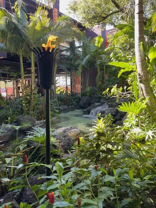
Disney’s Polynesian Village Resort is a deluxe Magic Kingdom Area resort in Walt Disney World. One of the 1971 original resorts, the Polynesian is a popular place to stay with convenient transportation to the Magic Kingdom, unique theming, and great views of Seven Seas Lagoon.
The last few years have featured a great deal of change at the Polynesian, one of Walt Disney World’s flagship resorts. We have seen a Moana room makeover, DVC room refreshes, club level enhancements, and a new entrance and monorail platform. In addition, we have seen progress continue on the new DVC expansion at the resort.
New Look For The Great Ceremonial House Lobby
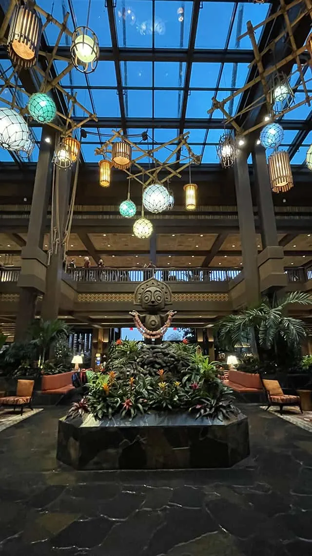
The resort’s lobby has been a source of debate for quite some time. Many longtime visitors to the Polynesian still miss the very tropical, atrium garden lobby that was removed in 2014. The picture above is from January of 2022, so you have a reference of the color scheme of seating areas that have been found in the lobby the last few years.
Recently, we had a mostly “soft goods” refresh to the Great Ceremonial House. Judging by what has been posted online, the reviews are mixed. Recently, members of our KtP team were able to get a closer look at the new theme in the lobby. What do you think?
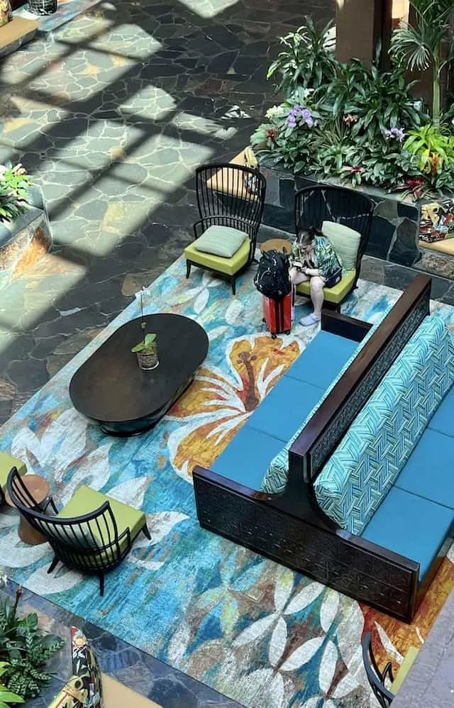
All rugs in the lobby have been replaced with a new pattern. The blues match the same blue found in the hanging light fixtures in the lobby. Most of he benches, that had previously been a plain red/orange color are much brighter and feature some of the blues found in the rugs. The prominent flower design in the rugs reminded me (Joe) of the other Moana theming recently added to the resort.
It is obvious that the new soft goods are much brighter, but the changes have some guests feeling like they are a little too “busy.” Take a closer look at the individual chair seating theme below.
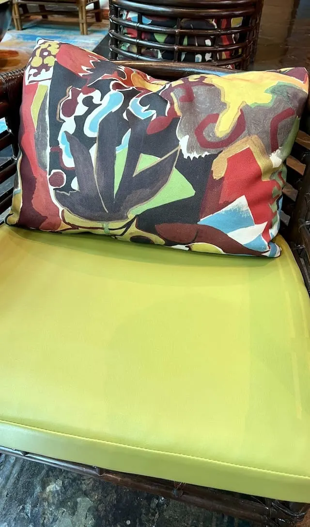
The builit-in benches also got a refresh with the same pillow pattern as the chairs but with a beige bench. This would be the one area in this refresh that I’m not impressed with.
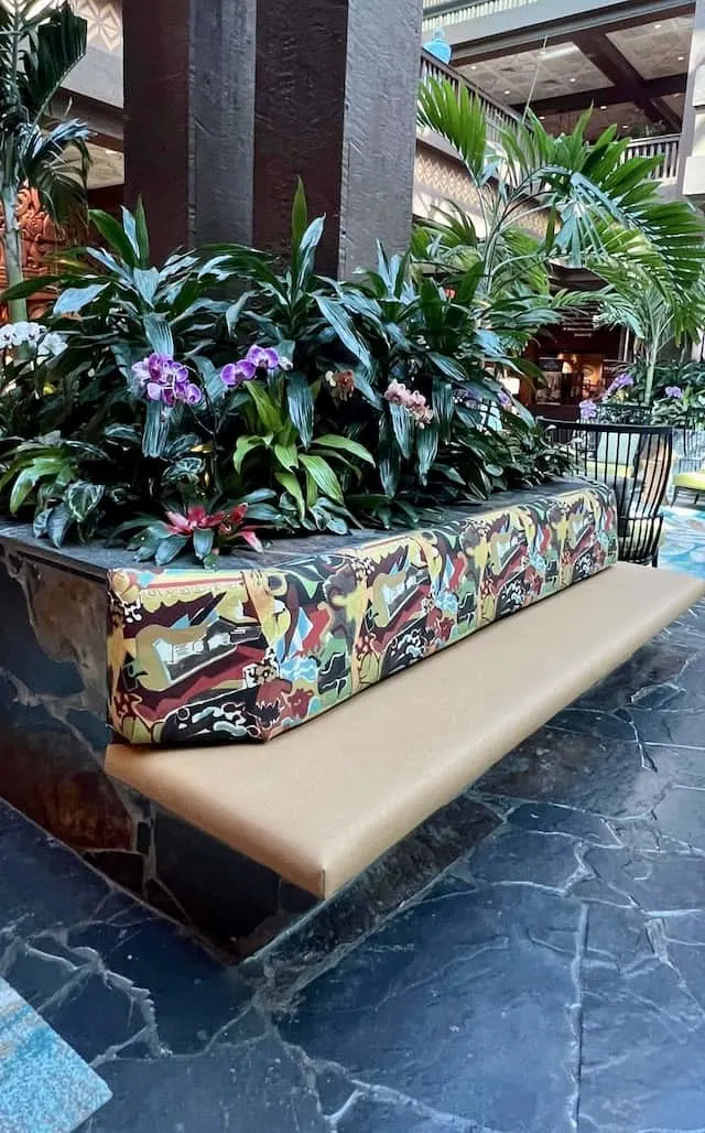
More lobby theming below. You will notice that some of the new fabrics did keep the red/orange theming.
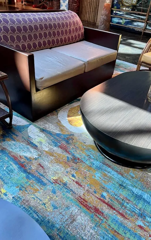
Finally, here is a zoomed in look at that pillow pattern below. There’s a lot going on here, but for the most part I think it works fine for the lobby design.
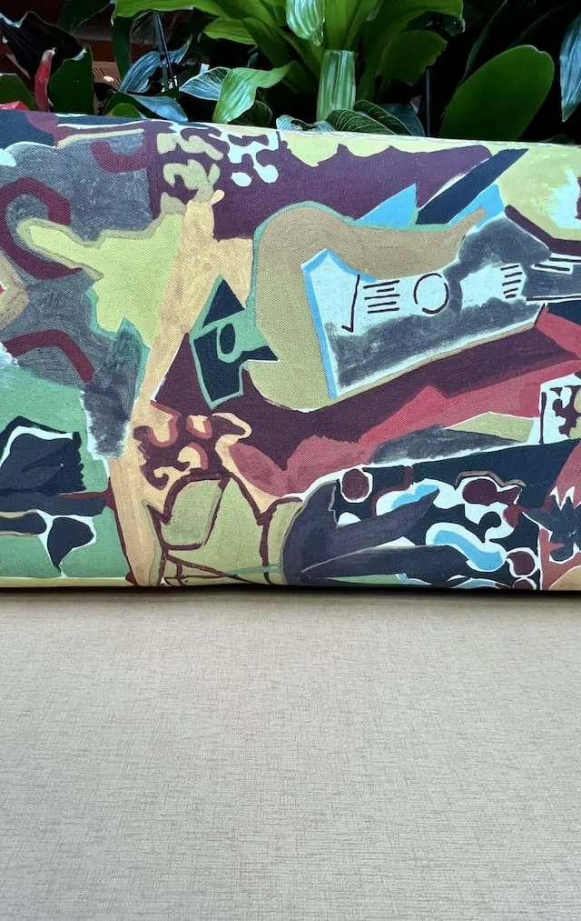
As I mentioned before, the reviews have definitely been mixed regarding this theme change. In my opinion, the best part of the refresh was the new rugs and couches with the brighter blue. I’m not a huge fan of the busy pattern with the beige benches, but overall I think this is a nice, brighter update for the lobby.
So what do you think of this soft goods refresh? Did you like the previous version better? Do you still miss the tropical atrium garden lobby? Let us know in the comments! Do you utilize the resort recreation activities? Check out my recent article regarding some expected changes here!
Discover more from KennythePirate.com
Subscribe to get the latest posts sent to your email.


Chris
Saturday 18th of March 2023
The new decor is great. But I also love coming back to a place with great memories and times with family. The Luau included.
Marcy
Tuesday 7th of March 2023
I agree. I loved the old lobby and the one before this one was at least relaxing. Not sure about this so let us know what you think after visiting. I won’t be there until August.
J
Tuesday 7th of March 2023
I do miss the original lobby with the water fall and all the flowers. The blue does remind me of the ocean. But, I want the feeling and smell of Hawaii ! I will know better next month when I am there!
Discover more from KennythePirate.com
Subscribe now to keep reading and get access to the full archive.
Continue reading