Disney updated the Disneyland and Disney World apps. They look very different now, and it will take some getting used to.
Disney Apps
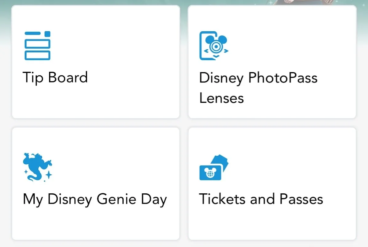
It is nearly impossible to visit Walt Disney World and Disnyeland without using Disney’s apps. After all, it has everything you need in order to enjoy a magical vacation!
From making dining reservations, ordering food, and Genie+, it has everything you need for an enjoyable visit to the parks.
The home screen has looked mostly the same for the last several years. Now, Disney has shuffled some things around, and it will take some getting used to.
How it used to look
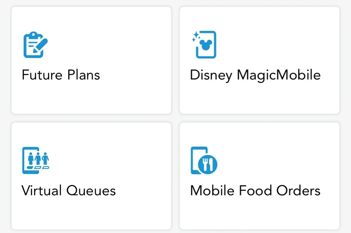
In the photo above, you can see how the main screen used to look. You could view the Tip Board and your Daily Plans. Plus, you could play around with PhotoPass Lenses and book your Virual Queue.
Everything was laid out in these boxes for easy navigating.
Once you scrolled through that, you would see options like your Profile, Car Locator, and other features that are not as “important” as the features in the boxes.
You will need to update your apps to see what’s new, which we have highlighed below.
What’s New
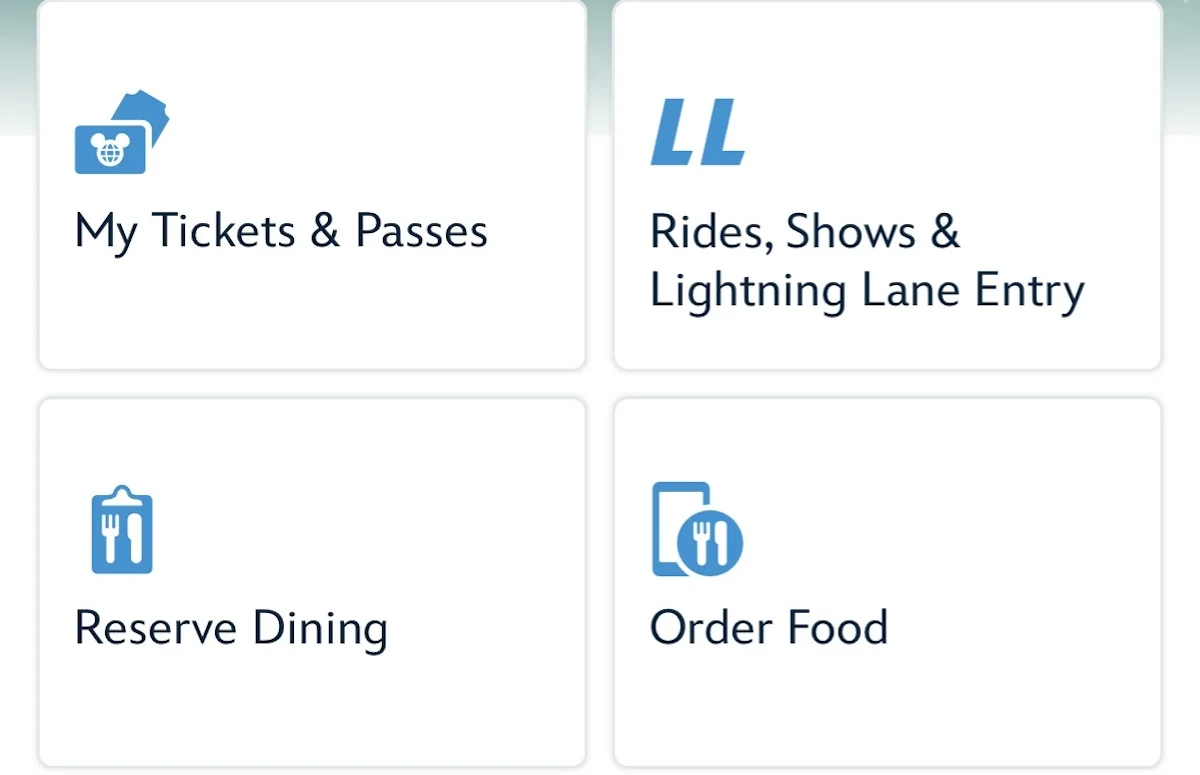
“Rides, Shows & Lightning Lane Entry” is now the home for the Tip Board and Daily Plans. If you want to see your Future Plans, Hotel Information, or Virtual Queue you will have to scroll farther down.
Dining reservations, Mobile ordering, and Merchandise checkout and more prominently featured.
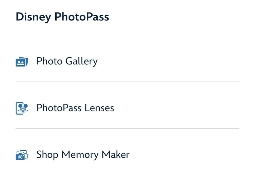
Disney PhotoPass galleries and lenses are featured farther down the page. Note that the home page, map, search function, and more options (under the + button) are all still the same.
Do you like this change? Do you think it will be harder or easier to find what you are looking for? Let us know in the comments below. And, share this post with a friend who uses the Disney apps frequently.
Discover more from KennythePirate.com
Subscribe to get the latest posts sent to your email.


What do you think?